Airpods 4
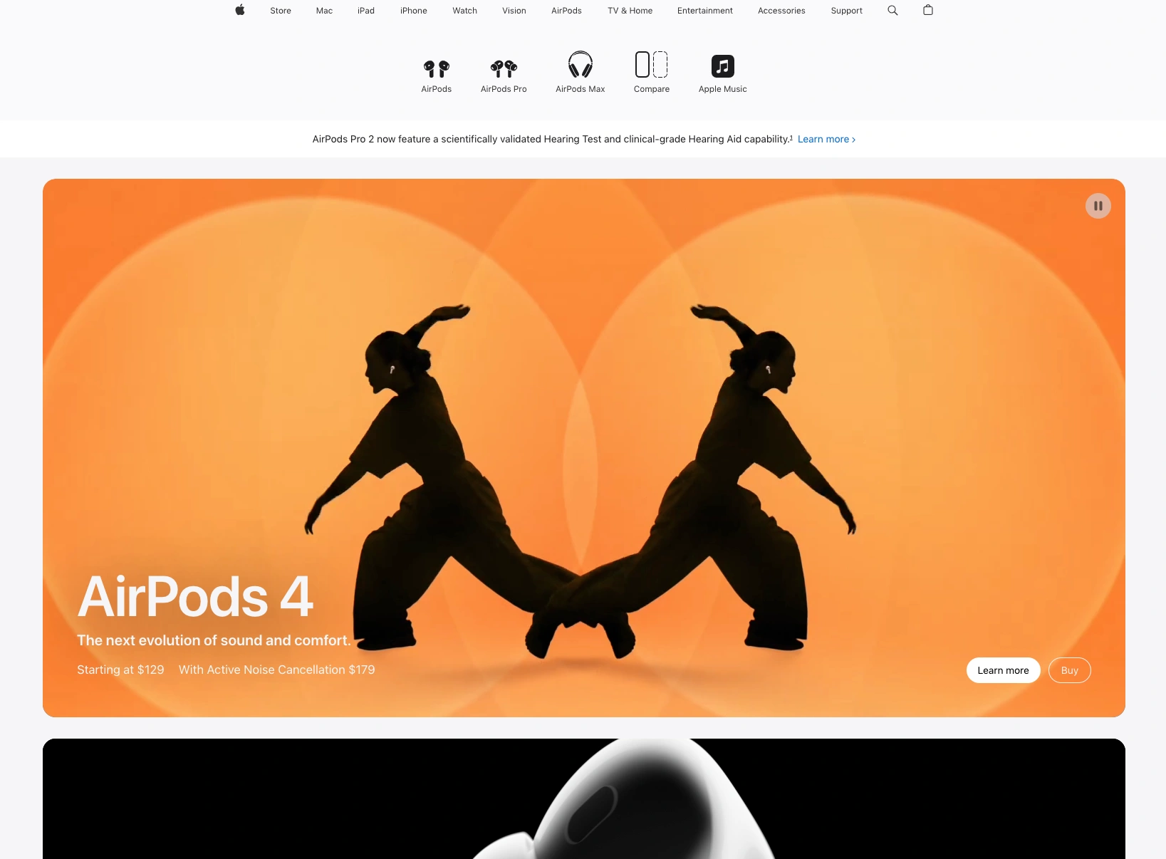
Apple once again proves its dominance in digital product storytelling with the AirPods 4 homepage—a stunning fusion of design, motion, and emotional resonance. Dominated by a vivid, kinetic orange backdrop, the hero section features mirrored silhouettes of dancers in mid-motion, evoking the rhythm, clarity, and freedom of movement that defines the AirPods experience. It’s not just a product pitch—it’s an immersive performance.
The layout is quintessentially Apple: clean, spacious, and intuitive. Typography is minimalist yet purposeful, with bold sans-serif text announcing “AirPods 4” alongside subtle cues on pricing and features like Active Noise Cancellation. Every design element guides the user’s eye, while animated transitions subtly reinforce the product’s seamless feel.
Interactivity is fluid. With clear CTAs—“Learn more” and “Buy”—Apple balances artistic flair with commercial clarity. The symmetry, movement, and color palette amplify the emotional appeal while staying perfectly aligned with the brand’s ethos: elegant innovation made personal.
This homepage exemplifies why Apple remains a benchmark for digital product launches. It’s not just about introducing new tech—it’s about inviting users into a beautifully crafted sensory world.